On a recent visit to the quiet surroundings of Minchinhampton in the Cotswolds, I got the chance to speak with the owner of Chestnut House about the house’s interiors. It was an education to have more light shed on the work that went behind creating such a stunning house, adding new life to a Georgian classic.
How would you describe the interior design and what was your inspiration?
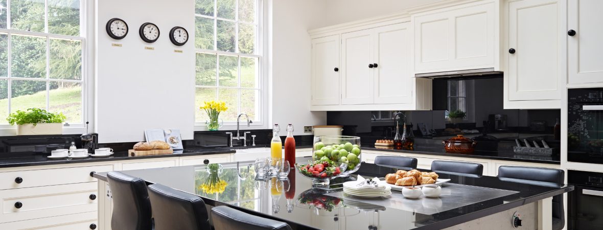
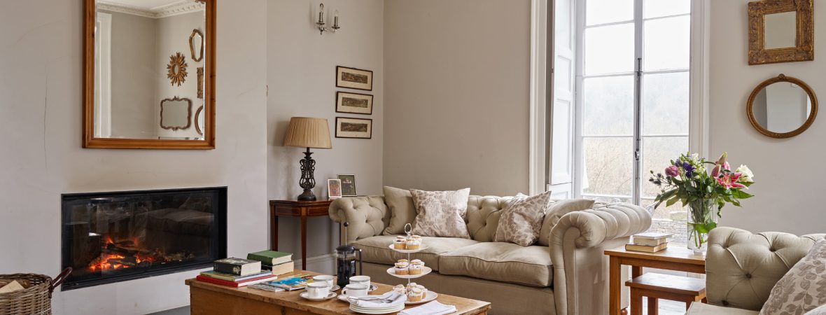
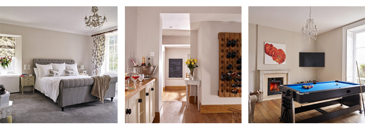
RUTH: Well, I joke it’s 50 Shades of Grey because we’ve probably used about eight to nine different shades of grey. I think there’s three or four used in the hallway. The reason I went for grey is because I find it very clean, elegant, and it’s quite a neutral colour, so you can make it more colourful by adding other fabrics. And it also lends itself equally to gilt and also modern chrome and silver, which we’ve used in different rooms. I’m minimalistic so I’m not one for knick-knacks and clutter. So I like clean lines, and the grey just lends itself to a lot of the white paintwork, shutter windows and large picture-frame windows. Lots of light.
What are your favourite features or pieces of furniture, and why?
The picture windows. Every room is so light. Even on a dark, grey day you don’t need lights on around the house. Another favourite feature is something we’ve put in – not at all classic for the period of the house – a modern log burner in the lounge; we’ve ripped out a very old, smaller fireplace. We’ve opened that up and made it very modern. Because the one thing we wanted when we bought the house was to modernise it, keep all the period features and sizes of all the rooms, but to make it very modern and relevant and comfortable. We’ve got under-floor heating and fires so it’s not a cold old house.

Where do you shop for furniture and decorations? Do you have any tips for people looking to design their house in a similar way?
I refer to a lot of home and garden magazines. We take our inspiration from other ideas. I use Pinterest, and also HomeSense, which is great for one-off cushions or throws – that sort of thing. I used to buy from Laura Ashley and one-off designer shops, but now you can just mix and match.
What do you think makes the house stand out?
Again I would say the colours, but I like the idea that we’ve got little clusters of mirrors. I love mirrors in a house. There’s currently two clusters but I’m going to do more on feature walls. There’s one upstairs with Victorian. It makes it look bigger, pretty, and it’s quite fun collecting them as well. They’ve all got a little history behind them for where I bought them from: a lot of them locally: Tetbury, Stroud, Oxford, so I knew what I wanted to achieve and I just kept an eye out for it. And I want to do more of those features.

What next? Do you have any ideas for future projects?
We need lots more one-off items like chairs, comfortable bedroom chairs, things like that, occasional chairs. I’m a bit picky so I’m finding it difficult to just go out and buy.
Are there any interesting facts/details about the interiors that people might not know about or might want to look out for when staying?
It was built by millers in the area – flour millers. They thrived 200 years ago so they built bits onto the house; this is part of a larger estate that was sold off back in the ’60s. But as they progressed they built on the front of the house, the Georgian façade as you see it now. During the war it was used as a kind of orphanage for children from London, to take refuge in the countryside. So back in the day it was full of lots of children running around. I think it would be quite nice to get more of the history onto the walls in frames. It would be nice to share that with the guests.
Describe the interiors in three words.
Minimalistic, fresh, quirky.


